
Flutter 学习10:NestedScrollView、SliverAppBar、TabBar
- Flutter 学习1:开发环境、开发工具、初始化一个项目
- Flutter 学习2:从main.dart文件说起
- Flutter 学习3:转场、导航
- Flutter 学习4:集成到原有的项目中
- Flutter 学习5:开发Dart包和插件包
- Flutter 学习6:绘制动画
- Flutter 学习7:Dart语言基础
- Flutter 学习8:BottomSheet
- Flutter 学习9:Positioned、Transform等控件使用以及手势控制
- Flutter 学习10:NestedScrollView、SliverAppBar、TabBar
前面说过Flutter提供了太多各种各样的Widget,给开发者带来了非常棒的开发体验,很多功能和效果只要拿官方提供的Widget来用就行了。 今天说的这几个Widget如果是Android开发者应该是比较熟悉了,在Android开发中应该会经常用到。
NestedScrollView、SliverAppBar
这两个Widget要放一起说,因为NestedScrollView其实跟Android中的一样,它是一个ScrollView,但是在Android中它可以和Toolbar配合进行交互,可以做出很多效果,比如折叠Toolbar、页面滚动的时候隐藏Toolbar等效果。在Flutter里面也是一样,不过这里用SliverAppBar来代替Toolbar的位置。
class NestedScrollView extends StatefulWidget {
  /// Creates a nested scroll view.
  ///
  /// The [reverse], [headerSliverBuilder], and [body] arguments must not be
  /// null.
  const NestedScrollView({
    Key key,
    this.controller,
    this.scrollDirection = Axis.vertical,
    this.reverse = false,
    this.physics,
    @required this.headerSliverBuilder,
    @required this.body,
  }) : assert(scrollDirection != null),
       assert(reverse != null),
       assert(headerSliverBuilder != null),
       assert(body != null),
       super(key: key);
...
NestedScrollView的源码,两个必须的参数headerSliverBuilder 、body,第一个是头部AppBar,第二个是页面的内容。
class SliverAppBar extends StatefulWidget {
  /// Creates a material design app bar that can be placed in a [CustomScrollView].
  ///
  /// The arguments [forceElevated], [primary], [floating], [pinned], [snap]
  /// and [automaticallyImplyLeading] must not be null.
  const SliverAppBar({
    Key key,
    this.leading,
    this.automaticallyImplyLeading = true,
    this.title,//标题
    this.actions,//操作菜单
    this.flexibleSpace,//可以展开区域,通常是一个FlexibleSpaceBar
    this.bottom,//底部内容区域
    this.elevation,
    this.forceElevated = false,
    this.backgroundColor,
    this.brightness,//主题明亮
    this.iconTheme,
    this.textTheme,
    this.primary = true,
    this.centerTitle,//标题是否居中
    this.titleSpacing = NavigationToolbar.kMiddleSpacing,
    this.expandedHeight,
    this.floating = false,
    this.pinned = false,//是否固定在顶部
    this.snap = false,
  }) : assert(automaticallyImplyLeading != null),
       assert(forceElevated != null),
       assert(primary != null),
       assert(titleSpacing != null),
       assert(floating != null),
       assert(pinned != null),
       assert(snap != null),
       assert(floating || !snap, 'The "snap" argument only makes sense for floating app bars.'),
       super(key: key);
...
SliverAppBar的源码,这个参数比较多,可以有很多变化调整。还是看看具体怎么用
AppBar滚动隐藏
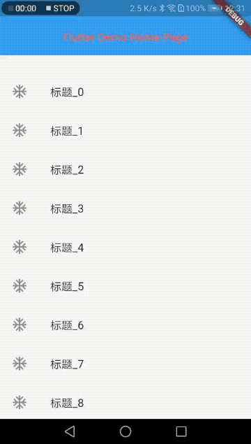
一个最常见的例子,在页面滚动的时候隐藏AppBar,如下图:
代码:
class _MyHomePageState extends State<MyHomePage> {
  @override
  Widget build(BuildContext context) {
    return Scaffold(
      body: NestedScrollView(
        headerSliverBuilder: (BuildContext context, bool innerBoxIsScrolled) {
          return <Widget>[
            SliverAppBar(
              title: Text(widget.title),
            )
          ];
        },
        body: ListView.builder(
          itemBuilder: (BuildContext context, int index) {
            return ListItemDemo('标题_$index');
          },
          itemCount: 50,
        ),
      ),
    );
  }
}

class ListItemDemo extends StatelessWidget {
  final String title;
  ListItemDemo(this.title);
  @override
  Widget build(BuildContext context) {
    return InkWell(
      child: ListTile(
        leading: Icon(Icons.ac_unit),
        title: Text(title),
      ),
    );
  }
}
这里SliverAppBar就用了一个参数title,其实这里滚动NestedScrollView的时候会隐藏SliverAppBar是因为里面的那个pinned的参数它默认就是false,它不固定在顶部所以会随页面滚动。但是这种效果相当于Row的布局,上面一个AppBar下面是ListView,一起网上滚了。
还有Android里面的常见的一种效果是,网上滚动隐藏AppBar,往下滑动的时候会马上显示AppBar。如下图:
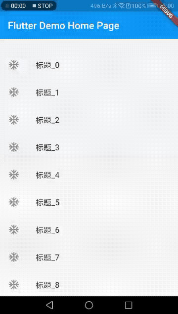
这种效果只要调整下SliverAppBar的两个参数就行了:
SliverAppBar(
    floating: true,
    snap: true,
    title: Text(widget.title),
)
😬
SliverAppBar展开折叠
还是先看效果:
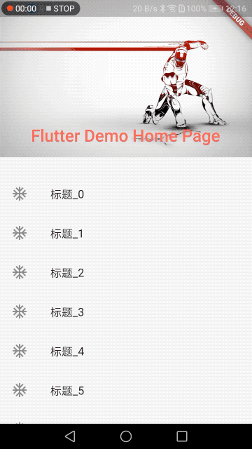
这个就是用了SliverAppBar的flexibleSpace参数,可以展开的区域。expandedHeight是初始化展开的高度。
        SliverAppBar(
              expandedHeight: 200.0,
              pinned: true,
              flexibleSpace: FlexibleSpaceBar(
                  centerTitle: true,
                  title: Text(widget.title,
                      style: TextStyle(
                        color: Colors.redAccent,
                        fontSize: 16.0,
                      )),
                  background: Image.network(
                    "https://timgsa.baidu.com/timg?image&quality=80&size=b9999_10000&sec=1550383267899&di=9b9fe57bd7a0bd55c7d673ad449360b1&imgtype=0&src=http%3A%2F%2Fpptdown.pptbz.com%2Fpptbeijing%2F%25E9%2592%25A2%25E9%2593%2581%25E4%25BE%25A0%25E5%25B8%2585%25E6%25B0%2594%25E6%2589%258B%25E7%25BB%2598%25E8%25AE%25BE%25E8%25AE%25A1PPT%25E8%2583%258C%25E6%2599%25AF%25E5%259B%25BE%25E7%2589%2587.jpg",
                    fit: BoxFit.fill,
                  )
                  ),
            )
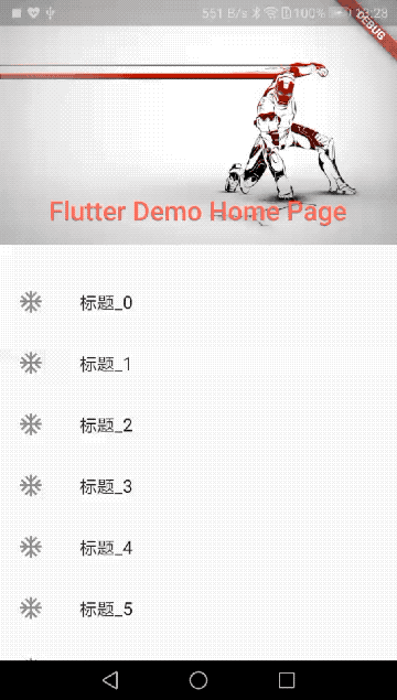
还是跟前面的例子一样把floating改成true,往下滚动的时候它就会马上还原。
代码:
SliverAppBar(
              expandedHeight: 200.0,
              floating: true,
              pinned: true,
              snap: true,
              flexibleSpace: FlexibleSpaceBar(
                  centerTitle: true,
                  title: Text(widget.title,
                      style: TextStyle(
                        color: Colors.redAccent,
                        fontSize: 16.0,
                      )),
                  background: Image.network(
                    "https://timgsa.baidu.com/timg?image&quality=80&size=b9999_10000&sec=1550383267899&di=9b9fe57bd7a0bd55c7d673ad449360b1&imgtype=0&src=http%3A%2F%2Fpptdown.pptbz.com%2Fpptbeijing%2F%25E9%2592%25A2%25E9%2593%2581%25E4%25BE%25A0%25E5%25B8%2585%25E6%25B0%2594%25E6%2589%258B%25E7%25BB%2598%25E8%25AE%25BE%25E8%25AE%25A1PPT%25E8%2583%258C%25E6%2599%25AF%25E5%259B%25BE%25E7%2589%2587.jpg",
                    fit: BoxFit.fill,
                  )
                  ),
            )
TabBar
这个TabBar还是在上面的例子基础上看看怎么使用,上面例子的NestedScrollView 它的两个必填参数中的headerSliverBuilder,不知道大家注意到了没,是一个Widget的数组不是一个对象。所以它其实可以放多个header进去的。这里我们借助SliverPersistentHeader这个Widget,它可以放入headerSliverBuilder中,并且还能控制内部的Widget在NestedScrollView滚动时候的展开折叠大小。
效果图:
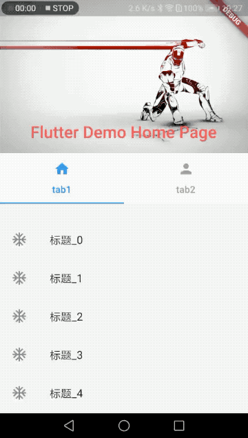
具体的代码:
class _MyHomePageState extends State<MyHomePage> with TickerProviderStateMixin {
  TabController _tabController;
  @override
  void initState() {
    super.initState();
    _tabController = TabController(length: 2, vsync: this);
    _tabController.addListener((){
      var index = _tabController.index;
      var previewIndex =_tabController.previousIndex;
      print('index:$index, preview:$previewIndex');
    });
  }
  @override
  void dispose() {
    _tabController.dispose();
    super.dispose();
  }
  @override
  Widget build(BuildContext context) {
    return Scaffold(
      body: NestedScrollView(
        headerSliverBuilder: (BuildContext context, bool innerBoxIsScrolled) {
          return <Widget>[
            SliverAppBar(
              expandedHeight: 200.0,
              floating: true,
              pinned: true,
              snap: true,
              flexibleSpace: FlexibleSpaceBar(
                  centerTitle: true,
                  title: Text(widget.title,
                      style: TextStyle(
                        color: Colors.redAccent,
                        fontSize: 16.0,
                      )),
                  background: Image.network(
                    "https://timgsa.baidu.com/timg?image&quality=80&size=b9999_10000&sec=1550383267899&di=9b9fe57bd7a0bd55c7d673ad449360b1&imgtype=0&src=http%3A%2F%2Fpptdown.pptbz.com%2Fpptbeijing%2F%25E9%2592%25A2%25E9%2593%2581%25E4%25BE%25A0%25E5%25B8%2585%25E6%25B0%2594%25E6%2589%258B%25E7%25BB%2598%25E8%25AE%25BE%25E8%25AE%25A1PPT%25E8%2583%258C%25E6%2599%25AF%25E5%259B%25BE%25E7%2589%2587.jpg",
                    fit: BoxFit.fill,
                  )
                  ),
            ),
            SliverPersistentHeader(
              delegate: _SliverPersistentHeaderDelegate(
                TabBar(
                  controller: _tabController,
                  labelColor: Colors.blue,
                  unselectedLabelColor: Colors.grey,
                  tabs: [
                    Tab(icon: Icon(Icons.home), text: "tab1"),
                    Tab(icon: Icon(Icons.person), text: "tab2"),
                  ]
                )
              ),
            )
          ];
        },
        body: ListView.builder(
          itemBuilder: (BuildContext context, int index) {
            return ListItemDemo('标题_$index');
          },
          itemCount: 50,
        ),
      ),
    );
  }
}

class ListItemDemo extends StatelessWidget {
  final String title;
  ListItemDemo(this.title);
  @override
  Widget build(BuildContext context) {
    return InkWell(
      child: ListTile(
        leading: Icon(Icons.ac_unit),
        title: Text(title),
      ),
    );
  }
}
class _SliverPersistentHeaderDelegate extends SliverPersistentHeaderDelegate {

  final TabBar _tabBar;

  _SliverPersistentHeaderDelegate(this._tabBar);
  @override
  Widget build(BuildContext context, double shrinkOffset, bool overlapsContent) {

    return Container(
      child: _tabBar,
      color: Colors.white,
      );
  }

  @override
  double get maxExtent => _tabBar.preferredSize.height;

  @override
  double get minExtent => _tabBar.preferredSize.height;

  @override
  bool shouldRebuild(SliverPersistentHeaderDelegate oldDelegate) {
    return false;
  }

}
这里说说TabBar,TabBar的部分源码:
const TabBar({
    Key key,
    @required this.tabs,
    this.controller,
    this.isScrollable = false,
    this.indicatorColor,
    this.indicatorWeight = 2.0,
    this.indicatorPadding = EdgeInsets.zero,
    this.indicator,
    this.indicatorSize,
    this.labelColor,
    this.labelStyle,
    this.labelPadding,
    this.unselectedLabelColor,
    this.unselectedLabelStyle,
    this.onTap,
  }) : assert(tabs != null),
       assert(isScrollable != null),
       assert(indicator != null || (indicatorWeight != null && indicatorWeight > 0.0)),
       assert(indicator != null || (indicatorPadding != null)),
       super(key: key);
既然它是TabBar肯定要两个及以上的Tab组成,所以有一个必填的属性tabs,就是Tab的数组。
还有一个比较重要的是controller属性,它是一个TabController对象,可以监听Tab的切换动作。上面例子里面可以看到添加监听的代码:
_tabController.addListener((){
      var index = _tabController.index;
      var previewIndex =_tabController.previousIndex;
      print('index:$index, preview:$previewIndex');
    });
还有其他一些修改指示器样式、tab文字样式、点击事件等等一看就明白啥意思的一些属性。还有如果Tab比较多的话需要滚动就把isScrollable设置为true。